Does This Sound Like You? How to Find Your Foundation Undertone
Undertone is one of the biggest reasons foundation can look wrong, even when the depth looks right. Learn what your mismatches are telling you and how to choose shades that look natural.
If your foundation is the right depth but still looks “off” on your face, undertone is usually the reason.
When a base looks too orange, too pink, too yellow or too grey, it is usually not a “bad foundation”. It is a clue that the pigment balance or vibrancy is wrong for your skin.
Finding your undertone is not about one quick trick. You may have been told to check your veins, try on gold and silver jewellery, or think about whether you burn or tan. These can sometimes give clues, but they are not precise enough for foundation matching. The vein trick is especially unreliable on deeper skin tones, where veins may be less visible or the skin depth can make vein colour difficult to judge accurately.
A better way to find your undertone is to look at what repeatedly happens when you try foundation. Your foundation mismatches can tell you a lot.
Want a shortcut? Try our foundation finder.
Quick answers
What is undertone?
Undertone is the underlying colour direction in your skin. It is the reason a foundation can be the right depth but still look wrong.
Why does foundation look orange on me?
Usually the shade has too much red + yellow pigment for your skin, so it reads too warm or too vibrant.
Why does foundation look grey or ashy on me?
Usually the shade is too muted or the pigment balance is off for your depth, so it looks flat rather than skin-like.
What’s the difference between undertone and surface tone?
Undertone is what stays relatively stable; surface tone is redness, pigmentation or tanning on top of the skin.
What if warm, cool and neutral all look wrong?
You may be olive, muted, or between standard categories. This guide shows what to look for.
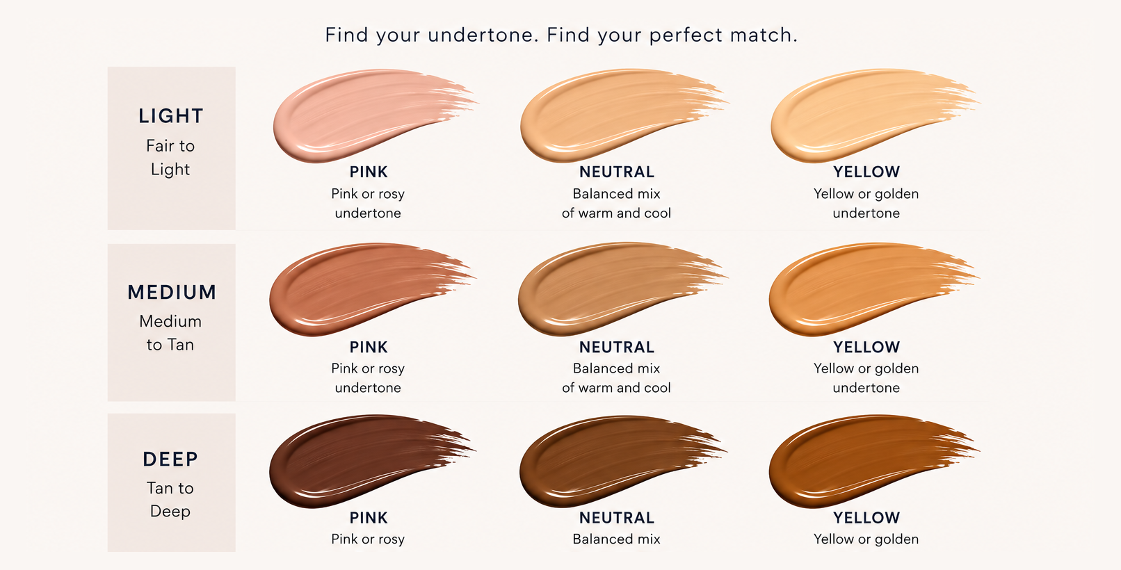
The four dimensions of skin colour
A good foundation match is not just about whether your skin is light, medium or deep. It needs to consider four main colour dimensions:
1. Depth
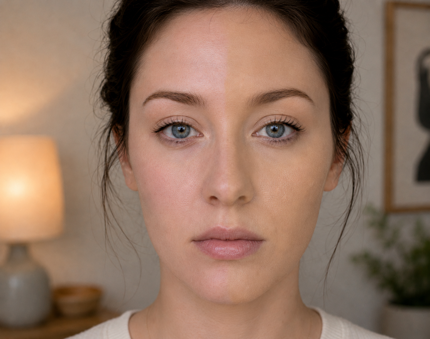
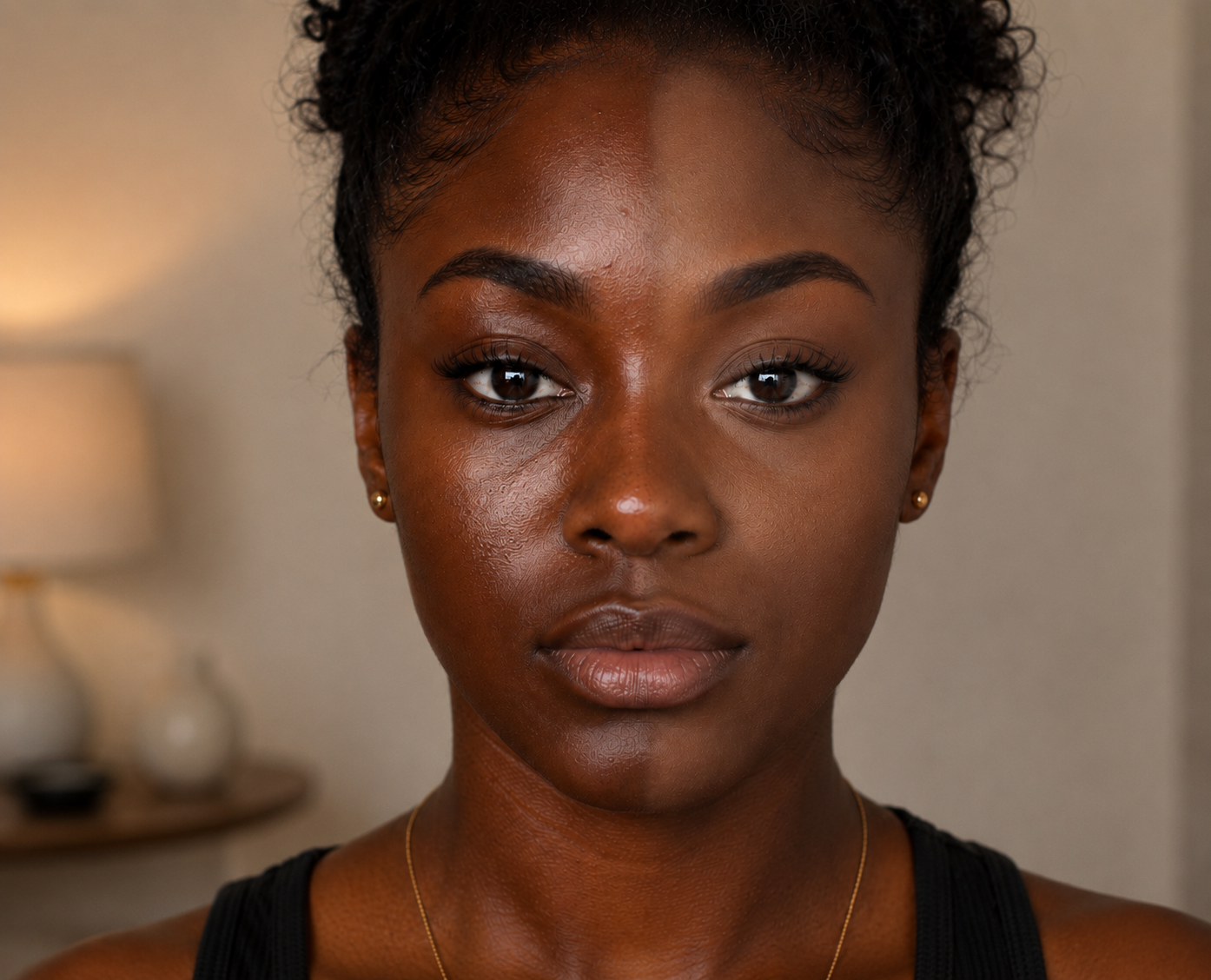
Depth is how light or deep your skin is. This is the part most people notice first, but it is only one part of the match.
2. Undertone
Undertone is the colour direction within that depth. Your undertone might be golden, peach, olive, rosy, red, neutral or somewhere in between.
3. Vibrancy
Vibrancy is how bright, muted or soft your skin tone appears. This is why two people can have the same depth and a similar undertone, but one needs a brighter shade while the other needs something duller, softer or more muted.
4. Surface tone
Surface tone can add another layer. Redness, pigmentation, tanning, freckles, acne marks or dullness can all affect what you see on top of the skin. These surface tones can influence how a foundation appears, but they are not always what you want to match exactly. For example, matching too closely to redness can make a foundation look too pink, while matching only to pigmentation can make the overall shade too deep.
This is why choosing foundation by depth alone rarely works. A shade can be the right level of lightness or darkness but still look wrong because the undertone or vibrancy is off. A good match should work with the underlying skin tone while helping balance surface colour.
A quick note on undertone labels
Undertone labels are helpful, but they are not universal.
Most shoppers expect warm to mean yellow, golden or peach, and cool to mean pink, rosy or red. But some brands use their own systems. For example, MAC’s traditional system can feel reversed compared with many other brands: MAC warm shades are often described as rosy or red, while MAC cool shades are often described as golden or olive.
This is why the label should guide you, not decide the match for you. The most useful question is not just “what does the brand call this shade?” but “how does this shade actually look on my skin?”
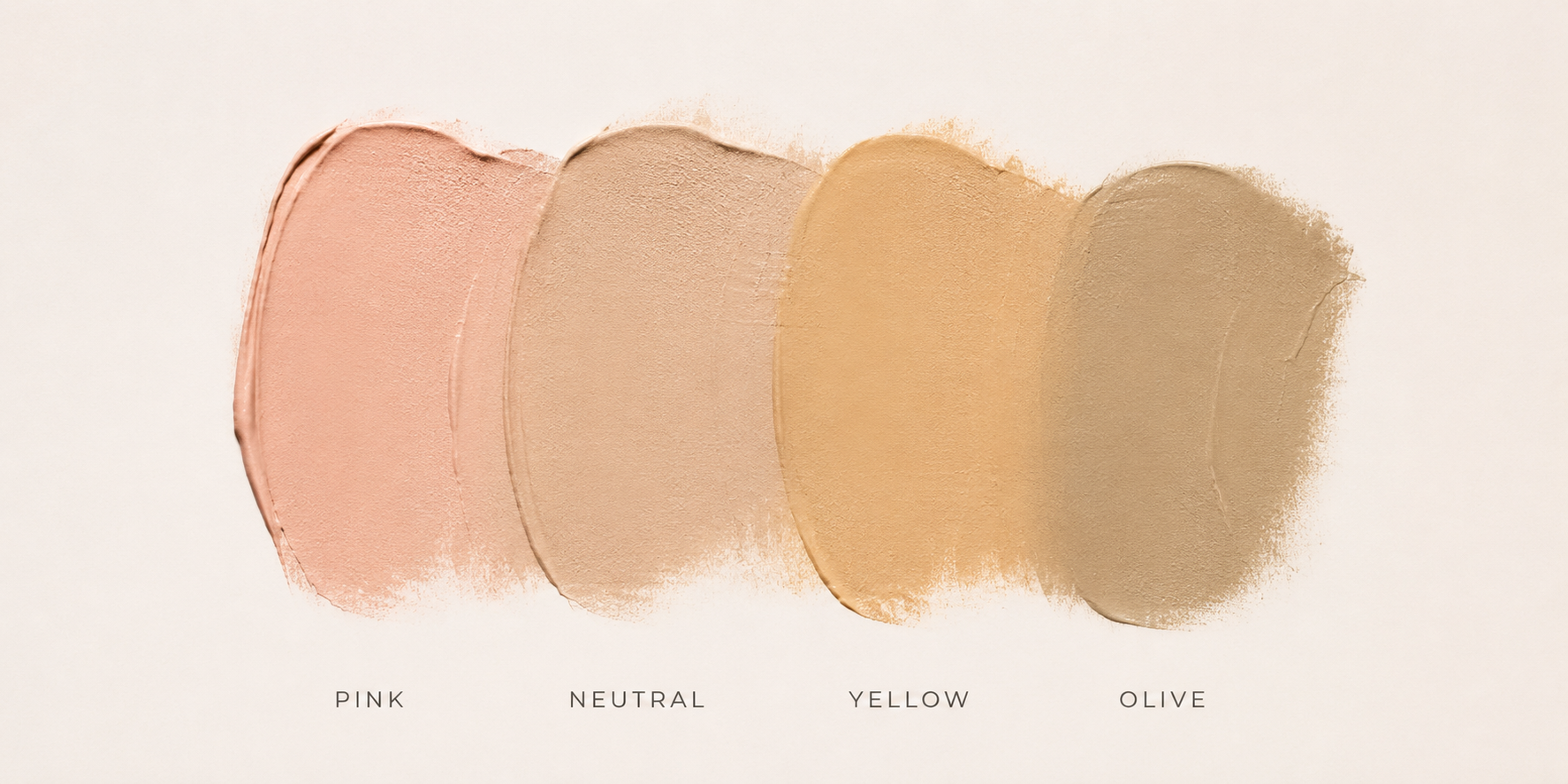
If foundation often looks orange or peach on you
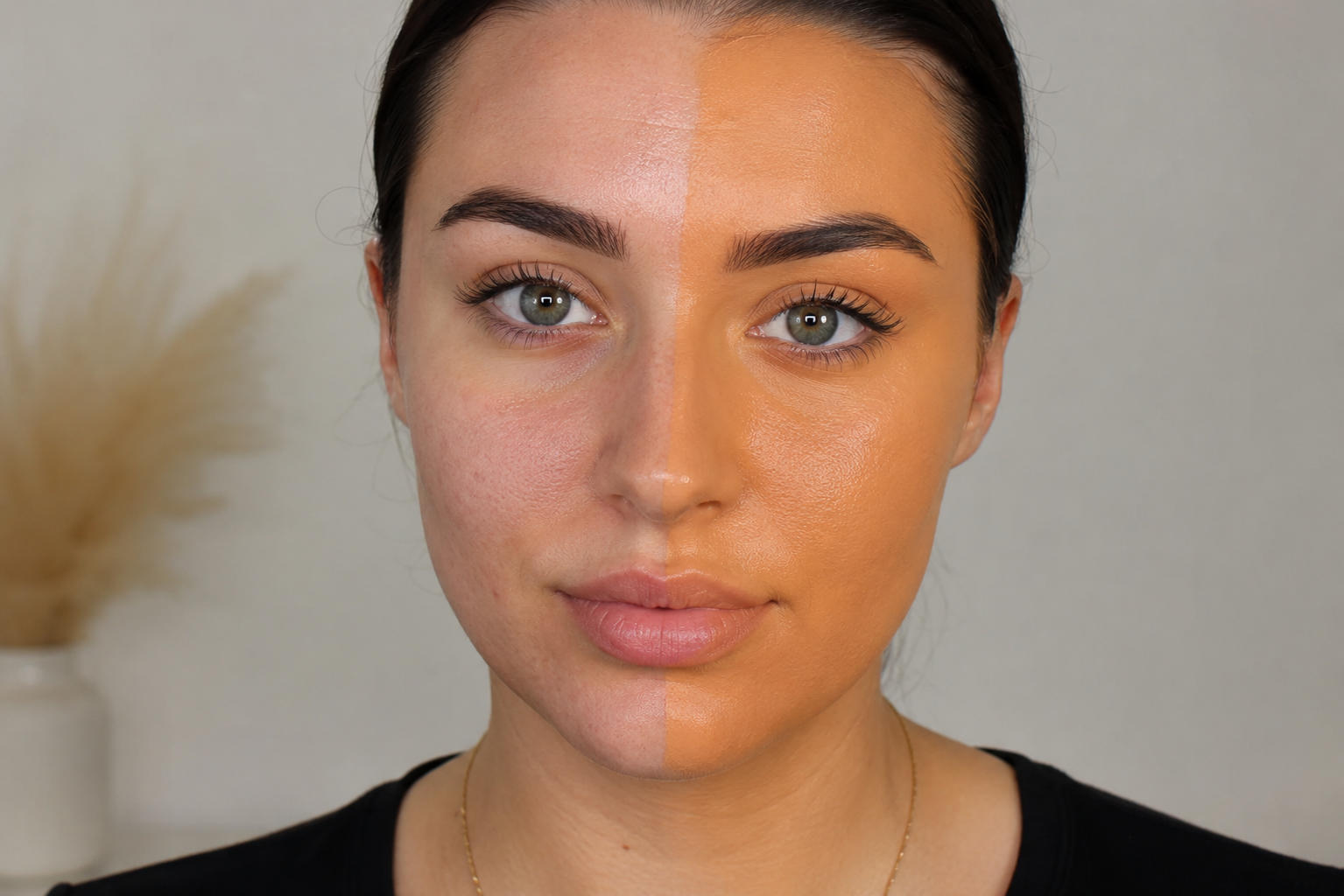
Both usually mean the shade has too much overall red-yellow colour for your skin. Warm usually means the shade has too much yellow and looks too vibrant, whereas orange or peach is often a sign there is too much overall colour (red and yellow) in the formula, which reads as orange.
On fair and light skin, orange or peach can show up quickly because the colour contrast is more obvious. On medium, tan and deep skin, orange or peach can make the foundation look disconnected, overly bright or too red-yellow rather than naturally warm.
If foundation often looks pink on you
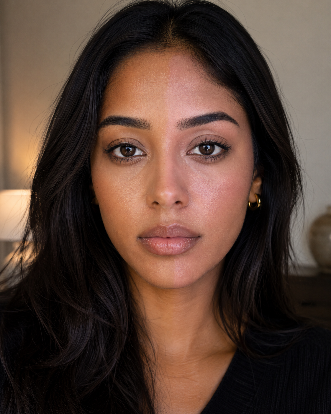
This usually means the shade is too cool or too red-based for your skin.
Cool foundations can be useful for fair or light skin with naturally pink or rosy undertones, and for deeper skin with red or berry-brown undertones. But if they make your complexion look flushed, mask-like, dull, slightly grey or separate from the rest of your face, the colour balance is probably wrong.
An overly pink foundation can make skin look dull because the rosy pigment is not balanced for your depth or how muted your skin tone is. Instead of blending in, the colour sits on top of the skin and can make the complexion look flatter, greyer or less healthy.
If foundation often looks yellow on you
This may mean the foundation has too much bright yellow pigment for your skin.
Some people do need golden or yellow-based shades across fair, medium and deep skin tones. But yellow can still be too strong, too precise or too bright. On fair skin it may look obviously sallow; on deeper skin it may look too golden, flat or disconnected if the shade lacks richness.
If foundation often looks grey, flat or ashy
This can happen when a shade is too light, too cool, too muted, or simply not the right pigment balance for your skin.
On fair and light skin, grey or flat foundation can happen when a shade is too beige or not balanced enough for the skin. On medium, tan and deep skin tones, ashiness is often a sign that the pigment balance is off, for example too little red-yellow colour overall for your depth, or the wrong balance between depth and colour.
If warm, cool and neutral all look wrong
This is often a clue that you may be olive, muted or somewhere between standard undertone categories.
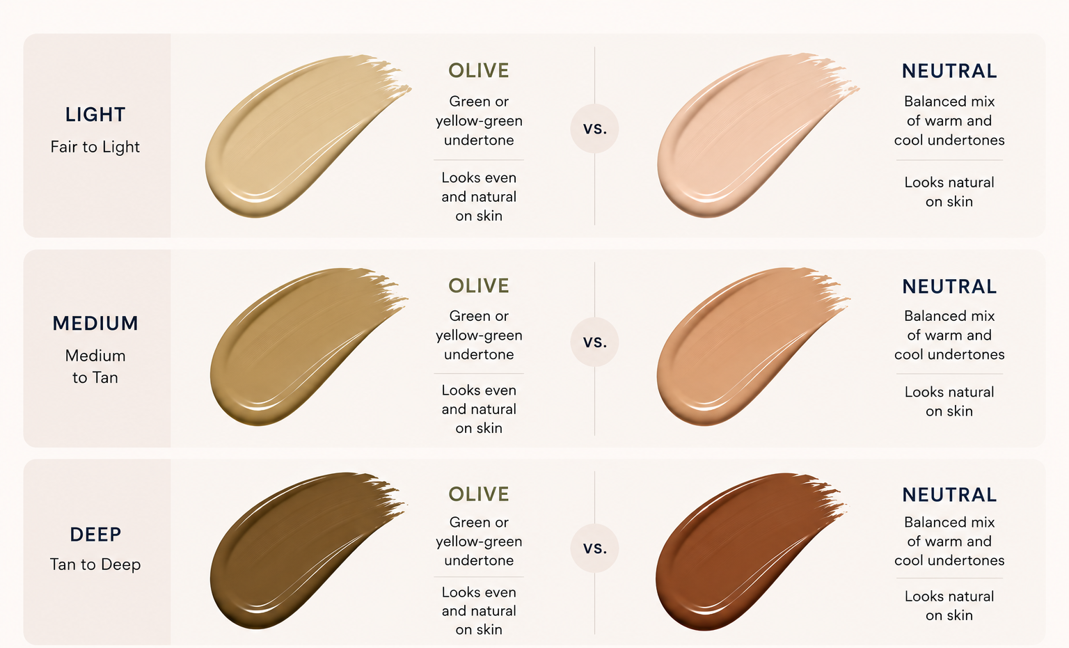
Olive skin is yellow, but duller and less vibrant. Because the yellow is less bright and less saturated, it can give the skin a softer, muted, slightly green-looking appearance compared with more precise golden, peach or pink undertones.
Olive undertones can appear in light, medium and deep skin tones. On lighter skin, olive may look muted, greyed or slightly beige. On deeper skin, olive may show as a softer golden-brown or muted yellow-brown rather than a bright golden or red undertone.
People with olive undertones often find that warm foundations look orange, cool foundations look pink, and neutral foundations look peach or beige.
The colour science behind undertone
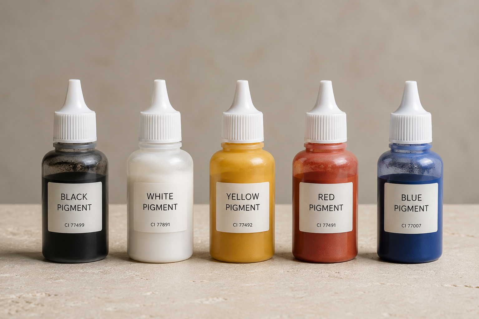
Foundation shades are created by blending pigments.
Most complexion products use combinations of white, black, red and yellow pigments to create different skin-like shades. In deeper shades, blue-based balancing pigments may also be used to create richer depth and prevent shades from becoming too orange, red or flat.
In simple terms:
White pigment lightens a shade, which is especially important in fair and light foundations.
Black pigment deepens or softens a shade, helping create tan, deep and rich shades.
Yellow pigment creates golden, warm or olive-leaning tones across all skin depths.
Red pigment creates pink, peach, rosy, red-brown or orange-leaning tones depending on the balance.
Blue-based balancing pigments are most relevant in deeper shade formulation, where they can help create depth, richness and balance excess warmth.
The exact balance of these pigments determines whether a foundation looks fair, medium, deep, warm, cool, neutral, olive, peach, golden, red or muted.
This is why two foundations with the same undertone label can look completely different. They may use different pigment balances, even if the shade description sounds similar.
How measured skin tone helps
Undertone is difficult because the human eye is easily influenced by lighting, redness, pigmentation, product labels and what we expect to see.
A measurement-led foundation finder can help by assessing visible skin colour more consistently and comparing it with reliable product colour data.
This does not mean ignoring undertone language. Warm, cool, neutral, olive and muted can still be useful. But the strongest match comes from looking at the actual colour relationship between your skin and the foundation, not just the label on the bottle.
SectionFinal takeaway
To find your undertone, do not rely on one trick or one label. Look at the patterns.
If foundation turns orange, pink, yellow, grey, peachy or too obvious again and again, your skin is telling you what kind of pigment balance it needs.
The science comes down to pigment balance. Fair shades often need careful control of pink, peach, yellow and beige balance, while deeper shades need enough richness and depth so they do not turn orange, red, grey or ashy.
The goal is not just to work out whether you are warm, cool or neutral. The better question is: what does my skin need more or less of for foundation to look natural?
Ready to stop guessing?
Still unsure what your undertone really is? Use our science-backed foundation finder to help identify your undertone once and for all, then find measured foundation shades that are designed to match your depth, undertone and vibrancy more accurately.
Get started here: analyze your skin.
If you need help taking a photo or troubleshooting, see our FAQ.